Telemundo Hackathon Case Study
In a 24 hour Hackathon, our team designed a new way for Telemundo’s Post Production Managers to track hours for their editors and projects.
Project Overview
Tools: Pen and Paper, Figma
Project Type: Hackathon
Timeline: 24 Hours
Client: Telemundo
The Challenge
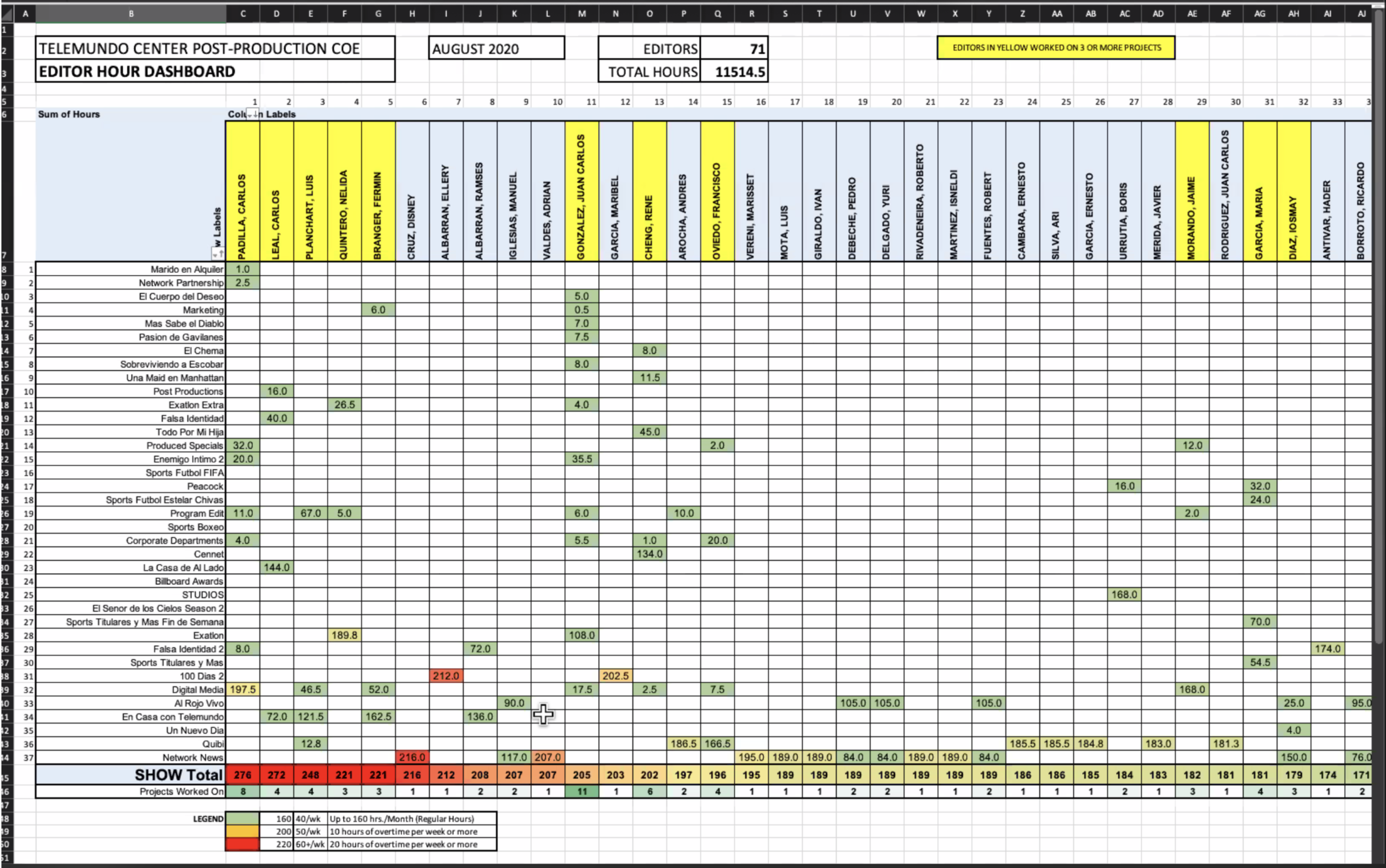
We were challenged by Telemundo to design a more efficient way for their Project Manager to easily view all the editor's hours and projects in order to track productivity. Their current way of viewing how many hours and projects were being worked on was inconvenient, and tedious.
We also got to work closely with developers.
Our team consisted of 2 UI / UX Designers, and 3 Developers. The minute we received our problem statement, and what our client needed, I tried to steer our team into quickly making a user story, and planned out our next steps to be the most productive as possible with the little time we had.
During our meeting with Telemundo, we listened closely to our client’s issues, pain points, and experiences that the post production managers deal with. We took that and made our persona.
In our original vision, we thought we would have two separate pages to view editors and projects. But then we quickly decided seeing everything on the same page would make it quicker to digest information.
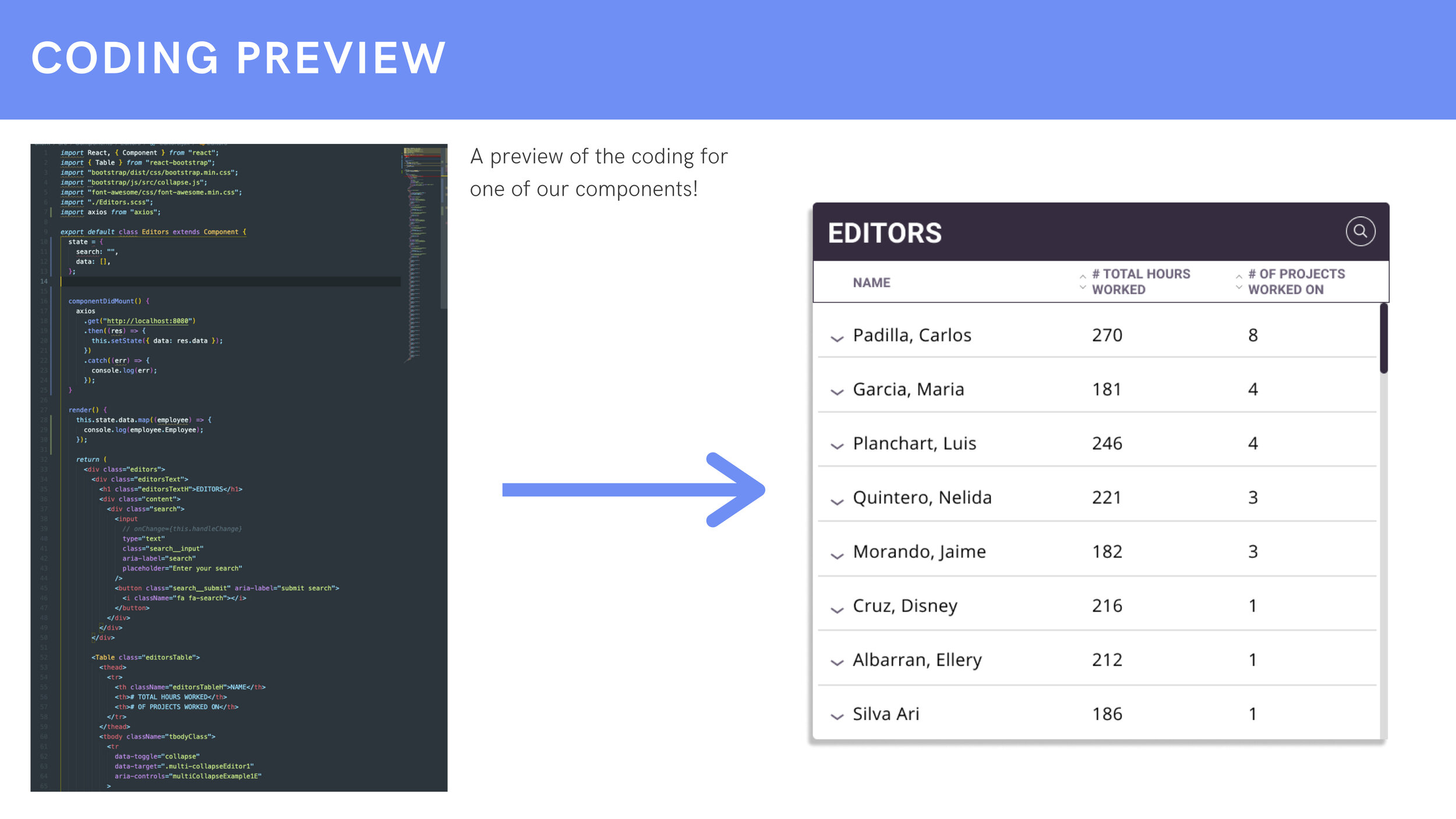
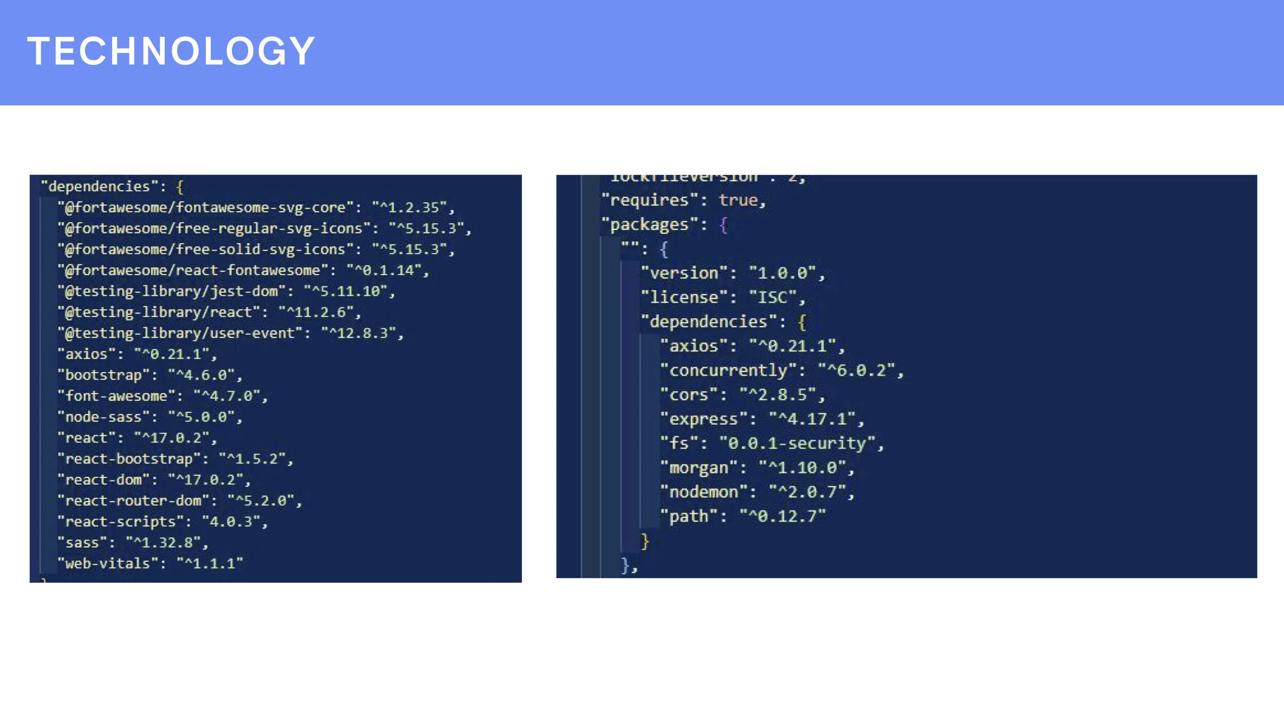
While we were hard at work trying to finalize the design as quickly as possible, our developers were working hard on their end too. I can’t speak for them, or say what they used, but they were with us every step of the way and decision we made. They worked quickly, and were attentive to the changes we made in the design while we were all sharing the same Figma file to work. Below are some previews to their code.
So this is the final preview that our developers accomplished in the 24 hours that we had. It’s amazing seeing our work come to life. My favorite part is the search bar and the animation they put in!
We also did a quick mockup of what it would look like if a post production manager would sign in on their mobile device, because maybe they’re on the go and they can’t access their desktop computer at that moment.
Final Thoughts
Even though our team didn’t win the competition, we did get an honorable mention! Which was very validating. Our client said they were impressed by the amount of work we were able to accomplish in such a short amount of time, and how far the developers got. It was such an honor getting to work with Telemundo and getting that unique experience of working with a client and developers at the same time.


